
Live demo : How to Make Rotating Image Holder For Blogger Images
Add Rotating Image Holder For Blogger Images
Part A. Adding HTML code to Blogger Post Editor's page
Step 1. Go to Blogger Dashboard >> Post or New Post
Step 2. Switch it HTML mode and paste the code below
<div align="center">Step 3. Replace the orange bold line with the image url of your own and the red bold line with your own image caption.
<div class="imgholder">
<div class="outer1 circle">
</div>
<div class="outer2 circle">
</div>
<br />
<figure>
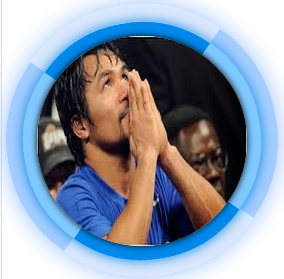
<img src="http://2.bp.blogspot.com/-0qwO4JXS1Dg/U1p3N65cHdI/AAAAAAAACJw/huqQ8h200qU/s1600/blogger+guest+author.jpg" />
<figcaption class="caption">Manny Pacman</figcaption>
</figure>
</div>
</div>
Recommended: How to upload images to Blogger and Get Image Link
Step 4. Save your work and your halfway done!
Part B. Adding of CSS to Blogger Template Source Code
Step 1. Go to Blogger Dashboard >> Template >> Edit HTML
Step 2. Look the code below
]]></b:skin>Step 3. Copy the code below and paste it above the code in step 2
.imgholder:hover img {
opacity: 1;
filter: alpha(opacity = 100);
transform: scale(1,1);
-ms-transform: scale(1,1);
-moz-transform: scale(1,1);
-webkit-transform: scale(1,1);
}
.imgholder img {
position: absolute;
left: 0;
top: 0;
width: 120px;
height: 120px;
z-index: 2;
/* border-radius: 100px; */
-moz-border-radius: 100px;
-webkit-border-radius: 100px;
opacity: 0.3;
filter: alpha(opacity = 30);
box-shadow: 0 0 5px #000;
-moz-box-shadow: 0 0 5px #000;
/* -webkit-box-shadow: 0 0 5px #000; */
transform: scale(0.5,0.5);
-ms-transform: scale(0.5,0.5);
-moz-transform: scale(0.5,0.5);
-webkit-transform: scale(0.5,0.5);
transition: opacity 1s, transform 1s ease-in-out 0.3s;
-moz-transition: opacity 1s, -moz-transform 1s ease-in-out 0.3s;
-webkit-transition: opacity 1s, -webkit-transform 1s ease-in-out 0.3s;
}
.imgholder:hover .outer1 {
border-color: #0088EA #7FC9FF #0088EA #7FC9FF;
box-shadow: 0 0 10px #0285E2;
-moz-box-shadow: 0 0 10px #0285E2;
-webkit-box-shadow: 0 0 10px #0285E2;
transform: rotate(-10deg);
-ms-transform: rotate(-10deg);
-moz-transform: rotate(-10deg);
-webkit-transform: rotate(-10deg);
}
.imgholder:hover .outer2{ opacity:0.9; filter: alpha(opacity = 90); transform: scale(1,1) rotate(-10deg); -ms-transform: scale(1,1) rotate(-10deg); -moz-transform: scale(1,1) rotate(-10deg); -webkit-transform: scale(1,1)rotate(-10deg);}
.imgholder .outer1 {
top: -8px;
left: -8px;
width: 120px;
height: 120px;
z-index: 2;
border: 8px solid;
border-color: #DEEBFC;
box-shadow: 0 0 3px #AFD3FF;
-moz-ox-shadow: 0 0 3px #AFD3FF;
-webkit-box-shadow: 0 0 3px #AFD3FF;
background: #ffffff;
background: -moz-radial-gradient(center, ellipse cover, #ffffff 0%, #e2efff 100%);
background: -webkit-gradient(radial, center center, 0px, center center, 100%, color-stop(0%,#ffffff), color-stop(100%,#e2efff));
/* background: -webkit-radial-gradient(center, ellipse cover, #ffffff 0%,#e2efff 100%); */
background: -o-radial-gradient(center, ellipse cover, #ffffff 0%,#e2efff 100%);
background: -ms-radial-gradient(center, ellipse cover, #ffffff 0%,#e2efff 100%);
background: radial-gradient(center, ellipse cover, #ffffff 0%,#e2efff 100%);
filter: progid:DXImageTransform.Microsoft.gradient( startColorstr='#ffffff', endColorstr='#e2efff',GradientType=1 );
transform: rotate(90deg);
-ms-transform: rotate(90deg);
-moz-transform: rotate(90deg);
-webkit-transform: rotate(90deg);
transition: transform 1.8s ease-in-out, box-shadow 1s ease-out, border-color 1.5s;
-moz-transition: -moz-transform 1.8s ease-in-out, -moz-box-shadow 1s ease-out, border-color 1.5s;
-webkit-transition: -webkit-transform 1.8s ease-in-out, -webkit-box-shadow 1s ease-out, border-color 1.5s;
}
.imgholder .circle {
position: absolute;
border-radius: 100px;
-moz-border-radius: 100px;
-webkit-border-radius: 100px;
}
.imgholder .outer2 {
top: -18px;
left: -18px;
width: 136px;
height: 136px;
z-index: 1;
border: 10px solid;
border-color: #D6E5FC #9BC8FF #D6E5FC #9BC8FF;
box-shadow: 0 0 20px #8EB9FF;
-moz-box-shadow: 0 0 20px #8EB9FF;
-webkit-box-shadow: 0 0 20px #8EB9FF;
opacity: 0;
filter: alpha(opacity = 0);
transform: scale(1.3,1.3) rotate(180deg);
-ms-transform: scale(1.3,1.3) rotate(180deg);
-moz-transform: scale(1.3,1.3) rotate(180deg);
-webkit-transform: scale(1.3,1.3) rotate(180deg);
transition: opacity 0.5s, transform 0.7s ease-out;
-moz-transition: opacity 0.5s, -moz-transform 0.7s ease-out;
-webkit-transition: opacity 0.5s, -webkit-transform 0.7s ease-out;
}
.imgholder .circle {
position: absolute;
border-radius: 100px;
-moz-border-radius: 100px;
-webkit-border-radius: 100px;
}
.imgholder:hover figcaption {
top: 85%;
}
.imgholder figcaption {
position: absolute;
left: -5px;
top: 31%;
width: 130px;
color: #004E87;
font-weight: bold;
text-shadow: -1px -1px 0 #fff;
z-index: 4;
transition: top 0.5s ease-out;
-moz-transition: top 0.5s ease-out;
-webkit-transition: top 0.5s ease-out;
}
Step 4. Save your work and your done with the tutorial
Customization:
We will focus first on the image holder on its default and with a mouse hover effects on it.
On default for image holder outer 1: Change the hexadecimal color #DEEBFC with another one. You can try also our hexadecimal colors.
With mouse hover for image holder outer 1: Replace the hexadecimal colors #0088EA #7FC9FF #0088EA #7FC9FF with another sets. The sequence is from top (#0088EA), right (#7FC9FF ), bottom (#0088EA ), and left ( #7FC9FF) respectively.
With mouse hover for image holder outer 2: Just change the hexadecimal colors #D6E5FC #9BC8FF #D6E5FC #9BC8FF with another sets. The sequence is from top (#D6E5FC), right (#9BC8FF ), bottom (#D6E5FC), and left ( #9BC8FF ) respectively.
For the image holder caption in its default setting, change #004E87 to change the color of the image caption. You can also change the margin by customizing the top and left attributes of the CSS under .imgholder figcaption.
And finally for the hover effect on the image caption, replace the margin attribute which is 85% for the top margin depending on the position of your caption of the image on your post.
About the Author:

Hello folks! This is GOLDEN WORKS TV, the admin of this blog. No words could described my grateful appreciations to all newbie and professional bloggers around the world and most especially to Almighty God who gave me the wisdom...Read More

No comments :
Post A Comment!
We love to hear your feedbacks and suggestions. We will try our best to reply to your queries as soon as time allows. Please keep in mind that all comments are moderated manually by our editors team to minimize spamming, and all the links are nofollow.
Note:
1. To add HTML code in the box, please use our HTML editor generator.
2. Please do not spam. Those type of comments will be deleted upon our review.
3. We should appreciate an individual and suggestive discussion.
Best Regards,
GOLDEN WORKS TV