How to Use Google Chrome to Customize My Blogger Templates

customize template through google chrome
Most of my tutorials  that I am sharing in this blog were done through the use of Google Chrome and  as a matter of  fact not only your own website where you can customize or edit the style sheet but any websites you wish, that is the beauty of having a Google Chrome browser. If you have not yet downloaded Google Chrome, download it here and set it as your default browser.
If you are not fun of using this method, you will find difficulty on customizing your own template because it will take time in going to your Blogger Template Editor's page, make some changes on it, save or preview and finally see the effect or the changes you have made. But the worse thing is if it doesn't go with what you would like to happen. Therefore you will repeat the whole process and that is very disgusting.
In this tutorial, I will show some basic techniques on how to align and style elements in your blog. You can also go to other blogs/sites to investigate what cascading style sheets (css) they are using. So, let us now go with steps!

How to Use Google Chrome to Customize My Blogger Templates


Supposing, I would like to redesign the appearance of my Menu Tabs.


 I will just point the mouse cursor on it then right click, and choose inspect element.

customize template using google chrome


After choosing the inspect element button, you will  be directed to the new widow with two columns.The first column (left side) shows the main HTML of my blog and the right column displays the CSS styles applied to each div section.

design template using google chrome


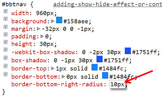
As you  try to move up or down with your mouse cursor over the div tags in the HTML section (left side) you will see that area being clearly highlighted inside your blog. Since I clicked on my menu tabs therefore the div section for the menu tabs is highlighted by default in the html section and I can clearly see its CSS styles appearing at right under the CSS column. Here is the CSS styles for the navbar as shown in the CSS column:
#bbtnav {
1. width: 960px;
2. background: #000000;
3. margin: -32px 0 0 -1px;
4. padding: 0;
5. height: 30px;
6. -webkit-box-shadow: 0 -2px 30px #1751ff;
7. box-shadow: 0 -1px 30px #1751ff;
8. border-top: 1px solid #1484fc;
9. border-bottom: 0px solid#1484fc;
}
You can see we are provided with 9 different properties.
a. Change the background color of the menu (2)
b. Adjust its width (1), and height (5), webkit-box-shadow (6 and 7)
c.  Adjust the alignment using margin (3) and padding (4)
d.  We can also adjust the thickness and the border styles my border-top and border-bottom.
e. And if we want to change the hexadecimal color of my border-top and border-bottom we just simply delete the hex#1484fc and replace it with another hexadecimal colors.

To edit any property above, just double click and change it. Lets change the background from (black) #000000 to blue (#158aee).

customize template using google chrome

I simply double clicked the background property and changed the color to #158aee from #000000. At the same time you can see it changing live on your blog too. See the screen shot below,

customize template using google chrome
The good thing is we can also add another property from the 9 given properties above. Let us say, we want to add a border-left with  the attributes of 1px solid #1484fc. Just point the mouse cursor beside this symbol " } " (without the quotation mark) and click then you will see a blank space. In that blank space you are going to type the additional property. See the screenshot below.

customize template using google chrome

Clicking on the ul tag will open its separate CSS properties on your right and clicking the li tag will open the list properties. You can then play around with the codes to see how the look changes on the blog and all these changes can be seen live on your blog as you edit without the need to log into your blog. Once your satisfied with the new settings just copy that CSS style and replace your current template style with it by logging into your blogger account.
Hope you enjoy this tutorial and if you have some queries regarding this post feel to leave it at the comment box below. Enjoy!!!

Putting a Show - Hide Effect or Content Spoiler in Blogger

I have already shared an article on how to add read more in blogger. But in this article I'm gonna show a trick on how to "show more or show less" a long article  in a certain page or post. I've learned the initial  codes from Greenlava and I modified it to make this tweak more fitted to newbie bloggers. You can utilize the code in pages, posts and even in widgets.

Live Demo

content spoiler or show-hide effect

Here are the features of this Content Spoiler
  • The button text changes accordingly. The "show more" will appear if it is in the hide state or the texts are hidden and "show less" will appear if it is in the show state mood.
  • You can use this spoiler in multiple manner  even in a single page.
  • The spoiler will not work in Internet Explorer .

Putting a Show - Hide Effect or Content Spoiler in Blogger


Step 1. Log-in to your Blogger account
Step 2. Click the Template button ( have a back - up of your template)
Step 3. Hit the Edit HTML button
Step 4. Look for the code below
</head>
Step 5. And just above that code </head> paste the following css code
<style type='text/css'>
/* animated spoiler CSS by Bloggingtipsandtrix.blogspot.com */
.spoilerbutton {
display:block;
margin:5px 0;
}
.spoiler {
overflow:hidden;
background: #f5f5f5;
}
.spoiler &gt; div {
-webkit-transition: all 0.2s ease;
-moz-transition: margin 0.2s ease;
-o-transition: all 0.2s ease;
transition: margin 0.2s ease;
}
.spoilerbutton[value=&quot;Show - More&quot;] + .spoiler &gt; div {margin-top:-100%;}
.spoilerbutton[value=&quot;Show - Less&quot;] + .spoiler {padding:5px;}
</style>

Step 6. Save your template!
Everytime you want to use the content spoiler, just paste the HTML (code) below in your blogger editor's page (be sure to switch your blogger editor page in HTML mode)
<input class="spoilerbutton" onclick="this.value=this.value=='Show - More'?'Show - Less':'Show - More';" type="button" value="Show - More" />

<div class="spoiler">
<div>
Your text here that you want to hide
</div>
</div>

Customization
  • You can change the background color of the "Show - More/Show - Less" or the content spoiler button by replacing the hexadecimal color f5f5f5 with your own. You can use our color code generator.
  • Replace the text Show - More with "Show"  and Show - Less with "Hide" or any text that you want, both in css code (step 5) and in HTML (below step 6 code).
  • You can adjust the speed of the texts that you hide in getting in and out  by adjusting the texts in green (0.2s). The unit is in seconds (s), therefore if you will lower the number from 0.2 s to 0.1s the speed will increase and if you increase the number from 0.2s to 0.3s, 0.4s, 0.5s, 0.6s, 0.7s the speed of getting in and out will  decrease.
If you have some questions regarding this post, kindly drop it at the comment section below. Thank you and
God Bless Us All!

Customize Post Title In Blogger- Increase Traffic

Customizing post title is no excuse if you are a good blogger. Having the options to change the margin, adding border-radius on it,  styling and adjusting the size of the font, adding background and have a hover effect on it really admire your vistors upon landing your site. In this article I will   show you not only the steps on how to customize the post titles but also on how to increase traffic in your blog  upon applying the H2-tag on it settings.
customize post titles using h2 tag
First, we will change  the settings of your Post Title. By default, all blogger templates are designed  in such a way  that the  Homepage Main Title is treated with the H1 tag, Blog Description or Header dates and sidebars headers are treated with an H2 tag , H3 is assigned for post titles. We know the fact  that your Post Titles are second most important part of  the blog after the main title and Sidebar Titles and Post description are just next in line  after to your post titles. Therefore we should threat your Post Titles with an H2 tag not H3 tag.

Live Demo


Treat Post Titles with an H2-tag


Step 1. Log in to your Blogger account
Step 2. Go to Blogger Dashboard
Step 3. Click the Template button (back-up your template for reference purposes)
Step 4. Hit the Edit HTML button
Step 5. Look for the opening code below and change it to <h2 [keep changing that for all (12) occurrences]
<h3
 Step 6.  Now search the closing tag below and change it  to </h2> [again keep on changing that tag for all (12) occurences]
</h3>

Step 7. It is now time to customize your Post Titles by treating them also with an h2-tag.
        7.1 Look for the code below
h3.post-title {
and change it to
h2.post-title {
       7.2 Just below the above code  (h2.post-title { ), paste the following css code
border-radius:5px 5px 5px 5px;
font:24px Boogaloo;
font-weight:normal;
margin-left:0;
margin-top:-15px;
padding:0;
color:#000000;
text-transform: capitalize;
text-align:center;
-webkit-transition: all 0.2s ease;
-moz-transition: all 0.2s;
-ms-transition: all 0.2s;
-o-transition: all 0.2s;
background:#ddd;
}
 h2.post-title:hover {
border-radius:0;
 background:#F78181;
-webkit-box-shadow: 0 -2px 15px #FE2E2E;
 box-shadow: 0 -1px 15px #FE2E2E;
border:1px solid #ff0000;
}

Customization:

  • Change the font size (24px). Higher value will increase the size of the font and lower value will also decreases its font size.
  •  And the  family (Boogaloo) to Helvetica, Sans-serif, Arial, Georgia, Times New Roman etc.
  • Remove the text in orange if you want to disable the hover effect on the post titles.
  • Change the hexadicimal color 000000 with your own. Please select it here.
Step 8. Save your Template and Congrats!You have now a newly customize post titles and I believe that in some other way this could help  increase your traffic. God Bless!!!

Putting a Cool Multi Column Footer Widget In Blogger

Do you want to make your visitors more busy after reading your posts? Aside from adding widgets such as read more , recent post and popular post, you can still add spice to your blog by adding a multi column footer on it.This  kind of footer could be three, four or as many as you want, you just simply adjust the width to let this footer fit to your blog's lay-out.

putting three column footer


Live Demo


Putting Multi Column Footer In Blogger


Step 1. Log -in to your Blogger Account
Step 2. Go to Blogger Dashboard and select the Template button (please back-up your template)
Step 3. Hit the Edit HTML button
Step 4. Search the code below
]]></b:skin>
Step 5. And just above ]]></b:skin , paste the following css code:
/*----- BBT COOL MULTI COLUMN FOOTER WIDGET -----*/
#lower {
margin:auto;
padding: 0px 0px 10px 0px;
width: 100%;
background:#158aee;
}
#lower-wrapper {
background:#ddd;
margin:auto;
padding: 20px 0px 20px 0px;
width: 960px;
border:0;
}
#lowerbar-wrapper {
background:#FE2EF7;
float: left;
margin: 0px 5px auto;
padding-bottom: 20px;
width: 23%;
text-align: justify;
color:#ddd;
font: bold 12px Arial, Tahoma, Verdana;
line-height: 1.6em;
word-wrap: break-word;
overflow: hidden;
-webkit-transition: all 0.2s ease;
-moz-transition: all 0.2s;
-ms-transition: all 0.2s;
-o-transition: all 0.2s;
border-radius: 30px;
}
#lowerbar-wrapper:hover{
border-radius:0;
background-color: #FE2EF7;
}

.lowerbar {margin: 0; padding: 0;}
.lowerbar .widget {margin: 0; padding: 10px 20px 0px 20px;}
.lowerbar h2 {
margin: 0px 0px 10px 0px;
padding: 3px 0px 3px 0px;
text-align: left;
border:0;
color:#ddd;
text-transform:uppercase;
font: bold 14px Arial, Tahoma, Verdana;
}
.lowerbar ul {
color:#fff;
margin: 0 auto;
padding: 0;
list-style-type: none;
}
.lowerbar li {
display:block;
color:#fff;
line-height: 1.6em;
margin-left: 0 !important;
padding: 6px;
border-bottom: 1px solid #222;
border-top: 1px solid #444;
list-style-type: none;
}
.lowerbar li a {
text-decoration:none; color: #d8d8d8;
}
.lowerbar li a:hover {
text-decoration:underline;
}
.lowerbar li:hover {
display:block;
background: #222;
}
Step 6. Now we will add a set of code to the body section  of your template. Search the code </body>
 and just above it paste the code below,
<div id='lower'>
<div id='lower-wrapper'>

<div id='lowerbar-wrapper'>
<b:section class='lowerbar' id='lowerbar1' preferred='yes'>
</b:section>
</div>

<div id='lowerbar-wrapper'>
<b:section class='lowerbar' id='lowerbar2' preferred='yes'>
</b:section>
</div>

<div id='lowerbar-wrapper'>
<b:section class='lowerbar' id='lowerbar3' preferred='yes'>
</b:section>
</div>

<div id='lowerbar-wrapper'>
<b:section class='lowerbar' id='lowerbar4' preferred='yes'>
</b:section>
</div>

<div style='clear: both;'/>
</div> </div>

Step 6. Now Save your Template!

Customization:

  • Replace 158aee  in order to change the color blue (outside your footer section). You can select your hexadecimal color here.
  • Replace ddd to change the color of your footer body section.
  • Replace FE2EF7 in order to change the pink background of your specific footer widget.
  • Replace d8d8d8  to change color title of your list item (li), like for example in the popular post widget the (first) list item is Sample Post for Testing.
  • Delete the orange highlighted text above if you want to disable the hover effect on your footer widget.
  • To subtract or get one column footer, just delete the tag 

  • <div id='lowerbar-wrapper'>  <b:section class='lowerbar' id='lowerbar4' preferred='yes'>  </b:section>  </div>

  • Or if you want to add another column footer, just add the code below,

  • <div id='lowerbar-wrapper'>  <b:section class='lowerbar' id='lowerbar5' preferred='yes'>  </b:section>  </div>
    But be sure to replace the width 23% with 17% in order to fit properly all your footer widgets in your footer's body section.

    If you have some questions regarding this post, try to contact me or leave a comment below.We are happy  to hear your voice pal.
    Enjoy and God Bless Us All!!!

How to Customize Sidebar Using Animated Borders In Blogger

Mastering the different SEO tips, providing quality and unique  contents to the visitors really matters most to bloggers who are goal-oriented. And having a unique and creative sidebar  also adds weigh in order to attract our readers  to stay a longer period of time in our site. This is important to guide the readers to take a look on to those plug-in, widgets and gadgets and consequently interact on them. Feel excited to apply this tweak on your blog? Please follow the steps below.

Live Demo


How to Animate Moz (Normal) Border In Blogger Sidebar

customize sidebar with hover effect


Step 1. Log-in to your Blogger Account
Step 2. Go to Blogger Dashboard
Step 3. Click Template (back-up your template)
Step 4. Hit the Edit HTML button
Step 5. Look for the code ]]></b:skin>
Step 6. Just above ]]></b:skin> paste the code below

.sidebar .widget {
border:2px dashed #FF0000;
padding:0;
-webkit-transition: all 0.2s ease;
-moz-transition: all 0.2s;
-ms-transition: all 0.2s;
-o-transition: all 0.2s;
background-color:none;
}
.sidebar .widget:hover {
border:2px ridge #DF0101;
padding:0;
}

  • Replace dashed with a different border styles here.
  • Change or replace the hexadecimal color FF0000 and DF0101  that would blend to blog's theme here.
Step 7. Save your Template!

How to Customize Sidebar Using Animated Moz- Border In Blogger


Live Demo

Step 1. Repeat step 1 to 5 above
Step 2. Paste the code below above ]]></b:skin>
.sidebar .widget {
border-top-left-radius: 0;
border-bottom-right-radius: 0;
padding:0;
-webkit-transition: all 0.2s ease;
-moz-transition: all 0.2s;
-ms-transition: all 0.2s;
-o-transition: all 0.2s;
background-color: #E6E6E6;
}
.sidebar .widget:hover {
border-top-right-radius: 20px;
border-bottom-left-radius: 20px;
padding: 0;
background-color: #D8D8D8;
}
Step 3. Save your Template and you are done!

Adding Webkit- Box-Shadow to Menu Tabs and Side Bar Title

Most professional blogs like Mybloggertricks  and Bloggertrix have a very beautiful navigation bar because they added a shadow that tends to glow if you look at it in a  closer mode. Take a glance also in my menu tabs above and in my sidebar titles as an example. Want to know how I have made it? Of course, I will share here in this article the process in making that webkit- box- shadow.

putting webkit box shadow to menu tabs


Adding Webkit- Box-Shadow to Menu Tabs or Navigation Bar


Step 1. Open your Blogger account and go to Blogger Dashboard section
Step 2. Click Template button (have a back-up of your template before proceeding to step 3)
Step 3. Hit  Edit HTML
Step 4. Look (Control F) for the code #bbtnav {  (this is part or included of whole CSS that is responsible for navigation bar)

This may look like this:
#bbtnav {
Some codes here.............
}
Note: To  know your own unordered list (ul) ID, like for example (bbtnav) in my case, just go to your blogger lay-out page and find the set of code that is responsible of your menu tabs. Usually this ul ID is located at the first part of the whole code. Or can attach or send your blog url at my contact page to let me find your ul ID of your navigation bar.

In my case, this is the set of codes:
<ul id='bbtnav'>
        <li>
          <a href='http://bloggingtipsandtrix.blogspot.com/'>Home</a>
         </li>
        <li>
          <a href='http://bloggingtipsandtrix.blogspot.com/2012/12/about-me.html'>About</a>
       </li>
        <li>
          <a href='http://bloggingtipsandtrix.blogspot.com/2013/04/var-servicedomainwww.html'>Contact</a>
        </li>
 <li>
          <a href='http://bloggingtipsandtrix.blogspot.com/2013/01/sitemap-for-blogging-tips-and-trix.html'>Sitemap</a>
        </li>
 <ul>
Step 4. Add the additional CSS code below to have a webkit-box-shadow on your navigation bar
-webkit-box-shadow: 0 -2px 30px #1751ff;
box-shadow: 0 -1px 30px #1751ff;
border-top: 1px solid #1484fc;
border-bottom: 1px solid #1484fc;

Therefore, your final CSS code will be:
#your ul ID here {
width: 961px;
background: #000000;
margin: -32px 0 0 -1px;
padding: 0;
height:30px;
-webkit-box-shadow: 0 -2px 30px #1751ff;
box-shadow: 0 -1px 30px #1751ff;
border-top: 1px solid #1484fc;
border-bottom: 1px solid #1484fc;

Step 5. Save your template.

Adding Webkit-Box-Shadow to Your Sidebar Title


adding webkit box shadow to sidebar title

Note: Before proceeding to the steps below, be sure you have already put a background color or an image to your sidebar title to make this tweak more effective.

Step 1. In your Blogger Template Editor's page look for the code

#PopularPosts1 h2 {
  • Popular Posts1 is the ID of your widget. To know how to get the particular ID of the widget you have inserted in your Lay-out page, click here
Step 2. Add the code below after the line   #Your widget Id here h2 {

-webkit-box-shadow: 0 -2px 20px #ffbf00;

  • Do these on all your sidebar title widget to have a uniform effects.
  • Change the hexadecimal color ffbf00 with your own. You can select it here.
Step 3. Save your template! And now visit your blog to see your new sidebar header title with  glowing effects.