How to Make Blockquote Styles In Blogger

Upon  my first experienced in this world of blogging tutorials, I was wondering  on how to display my blockquote codes in a manner that my readers can distinguish them from my ordinary texts. So I was keep on researching on the web, experimenting the effects of CSS until I came - up with a beautiful one. Since I do't want to monopolize this gift from God, I am dare to share it with you on how to make it. I would humbly say that because of Muhammad Mustafa I was able to learn this tweak but of course with additional spices to make it more fitted to your blog. I would present this one a quite different to be learnt easily by the  newbie  bloggers.  So, let us now go with the tutorial!

How to Make Blockquote Styles In Blogger


Step 1. Log - in to your Blogger Dashboard
Step 2. Hit the Template button (have a back-up of your template as your reference)
Step 3. Click The Edit HTML button
Step 4. Find or search the code/tag below
.post blockquote 
In most cases the code will look like this:
.post-body blockquote {some codes here}
OR
.post blockquote{ some codes here}

But if you did't find the above code or tag above, It is fine.
Step 5. Now search for code below

]]></b:skin>


And just above ]]></b:skin> , you choose among the blockquote styles codes  below that would most fit to your blog.

Copyrighted Blockquote with Gradient Yellow Image at the Left Side and Small Solid Borders


Live Demo

.post blockquote {
font: 14px normal verdana, sans-serif;
padding-left: 38px ;
margin:0 20px;
background: url(https://blogger.googleusercontent.com/img/b/R29vZ2xl/AVvXsEjsWXh0DBFJKOsBPJp9QJ8q6i3QYKkwA4G28yqQAA0IniFZ3M_T4R0hgpz_cuR984oI_z4jDSk_NasSldnN4VDnsnsxmMk6Hrk2G_R36us0o_2W1xOFVXkRKE12-6DkCbCUJR5jlc5zvpID/s1600/blocquote+yellow.png);
background-position:;
background-repeat:repeat-y;
text-indent: 65px;
border-top: 3px solid #61380B;
border-right: 3px solid #f4fa58;
}
.post blockquote div {
display: block;
background: url(https://blogger.googleusercontent.com/img/b/R29vZ2xl/AVvXsEiiXRzbi9gKGkGMUD41EIKyIjR6wtYqqIf-EBUDdyfQyedSiEo-71KYZ0Hhr9dZa9Qr16-6cUym9XFCBejxIjHg3jrMaDDEjY5H7eKTkCUazaTf6NPLqqbeCvSQqeo8hfAzDHGb1wAf3HsU/s1600/blockquote+4.png) no-repeat bottom center;
padding-bottom:20px;
border-bottom: 10px solid #F4FA58;
margin-left: -20px
}
.post blockquote p {
margin: 0;
padding-top:10px;
}

Live Demo

Blockquote Codes:
.post blockquote { 
margin : 0 20px; 
padding: 20px 20px 50px 20px; 
background : #ddd url(https://blogger.googleusercontent.com/img/b/R29vZ2xl/AVvXsEicNGo5El7GW7hyphenhyphenOqIh9ofD58ibhezJGmSpGrNqeUYXEJmRFtf9pBJxiS8M5Yak0igylWrmwKL1m5-llSuu38a23PljvrMMZi9wvdLGlBaE7w0zpnD_yVMfLB_S0SofhPPZXS7nMiut2HWS/s1600/Scanned+black+blockquote.png) no-repeat center bottom; 
font: bold .9em "verdana", Georgia; 
color : #000; 
border-top: 2px solid #000; 
border-right: 2px solid #000;
border-bottom: 2px solid #000;
border-left: 2px solid #000; 
}
.post blockquote p { 
margin: 0; 
padding-top:10px; 
}

Live Demo

Blockquote Codes:
blockquote {
margin : 0 20px;
padding: 20px 20px 20px 20px;
background : #fff url( ) no-repeat top;
font: normal 1em "Times New Roman", Times, serif;
color : #000000;
border-top : 7px solid #FF0000;
border-right : 7px solid #FF0000;
border-bottom : 7px solid #FF0000;
border-left : 7px solid #FF0000;
}
}
blockquote p {
margin: 0;
padding-top:5px;
}


Live Demo

Blockquote Codes:
.post blockquote {
margin : 0 20px;
padding: 20px 20px 50px 20px;
background : #ddd url(https://blogger.googleusercontent.com/img/b/R29vZ2xl/AVvXsEhmQJkwF8ggmSWL1UeX2tTP76MrAPeyxVP32JLdYf0byybNY6GvBaoWxZoY7Ek8hl4BY2vfduvlVtFqYHFmGbjabv-5pmrrp1-fwp3B8IQO-gAoJNndKKYPQiATw4aNr9Z65BkOwUy5TU1w/s1600/Copyrighted+blue+blockquote.png) no-repeat center bottom;
font: bold .9em "comic sans ms", arial, Helvetica,verdana, Georgia;
color : #484848;
border-top: 2px solid #158aee;
border-left: 2px solid #158aee;
border-right: 2px solid #158aee;
border-bottom: 2px solid #158aee;
}
.post blockquote p {
margin: 0;
padding-top:10px;
}

Live Demo

Blockquote Codes:
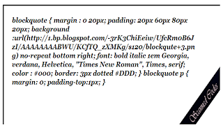
blockquote {
margin : 0 20px;
padding: 20px 60px 80px 20px;
background :url(https://blogger.googleusercontent.com/img/b/R29vZ2xl/AVvXsEiMVQuGH7nd1nqV2YsI1cyzYnC3ZlWFHWsPS4K_UQyFxR5d_alhi-NFeEA4G0zuGdd7AdcJh1Sgk8RGGpw0p-tmBDzgx4n8cejH7lvelPXFXN11ntOgYHNi6oVO2xPYc-QW4h41O_ob1M25/s120/blockqute+3.png) no-repeat bottom right;
font: bold italic 1em  Georgia, verdana, Helvetica,  "Times New Roman", Times, serif;
color : #000;
border-top: 3px ridge #000;
border-left: 3px ridge #000;
}
blockquote p {
margin: 0;
padding-top:1px;
}


Live Demo
Blockquote Codes:
.post blockquote {
background: #F3F3F1 url(https://blogger.googleusercontent.com/img/b/R29vZ2xl/AVvXsEh3EHz6_N1_124-4gkF1lzR49ApmM8c5JP4pdrkfVRflX_rDBpKXhmYYZdmTFOMs4_tfFge1OAUQa-71kAw3zi7lOnjmr6-7msZbfsCvaDM1ySb-vPlD90qgLw0m-I08qws270_dP1BwdSa/s1600/blockquote.png) ;
background-repeat:repeat-y;
margin: 0 20px;
padding: 20px 20px 10px 45px;
font-size: 0.9em;
font: italic 1em Vivaldi, serif;
border-top : 3px ridge #FF8000;
border-right : 3px ridge #FF8000;
border-bottom : 3px ridge #FF8000;
border-left : 3px ridge #FF8000;
}
.post blockquote p {
margin: 0;
padding-top: 10px;
}

Customization (Optional):
The above blockquote codes were bolded in the manner to make you easily customize  according to your preferences.
  • Margin  :- ) This refers to the position of your whole blockquote.
  • Padding  :- It changes the distance of your texts from the borders of your blockquote. 
  • Background >> This includes blockquote background color in six digit value and the image URL that is being used . You can replace the hexadecimal color and the image URl respectively.
  • Font >: This includes the font style, size, and type respectively.
  • Color >> This is the color of your texts of your blockquote, you can use our  free color code generator to choose a wide variety of colors.
  • Border >.. In the above codes, I arranged the border styles from top, right, bottom, and left. Along with each are the border size, style and color. You can also use  this link to choose different border styles.

Step 6. After you made some customization of you blockquote codes, you may now save your template.

Whenever you have  some quotes or codes to share with your readers just follow the  steps below:
1. Go to post or create new post
2. Switch it in the compose mode and type your quotes.
3. After typing your quote in the compose mode, switch it to HTML mode.
4. Then  add these tags "<blockquote>.......</blockquote>" . It may look like this:
<blockquote>
Your quotes here
</blockquote>

Now if you want to apply different blockquote styles in your blog, simply copy the blockquote codes above and paste it to you Blogger Post Editor page (it should be in the HTML Mode). For example you want to apply the Blockquote With Ridge Border Style. The  setting will be  this one:

<style>
.post blockquote {
background: #F3F3F1 url(https://blogger.googleusercontent.com/img/b/R29vZ2xl/AVvXsEh3EHz6_N1_124-4gkF1lzR49ApmM8c5JP4pdrkfVRflX_rDBpKXhmYYZdmTFOMs4_tfFge1OAUQa-71kAw3zi7lOnjmr6-7msZbfsCvaDM1ySb-vPlD90qgLw0m-I08qws270_dP1BwdSa/s1600/blockquote.png) ;
background-repeat:repeat-y;
margin: 0 20px;
padding: 20px 20px 10px 45px;
font-size: 0.9em;
font: italic 1em Vivaldi, serif;
border-right : 3px ridge #FF8000;
border-bottom : 3px ridge #FF8000;
border-top : 3px ridge #FF8000;
border-left : 3px ridge #FF8000;
}
.post blockquote p {
margin: 0;
padding-top: 10px;
}
</style>
<blockquote>
Your quote or codes here........
</blockquote>

Note:- For Blockquotes with yellow gradient, there is a little more coding required. Read below

Guide:- For above mentioned blockquotes you need to add some extra tags inside blogger editor as explained below,
Now, whenever you have written a Quote inside the compose mode of Blogger Editor simply switch to the HTML mode and add two tags i.e <div> and </div> between the blockquote tags as demonstrated below.

<style>
.post blockquote {
font: 14px normal verdana, sans-serif;
padding-left: 38px ;
margin:0 20px;
background: url(https://blogger.googleusercontent.com/img/b/R29vZ2xl/AVvXsEjsWXh0DBFJKOsBPJp9QJ8q6i3QYKkwA4G28yqQAA0IniFZ3M_T4R0hgpz_cuR984oI_z4jDSk_NasSldnN4VDnsnsxmMk6Hrk2G_R36us0o_2W1xOFVXkRKE12-6DkCbCUJR5jlc5zvpID/s1600/blocquote+yellow.png);
background-position:;
background-repeat:repeat-y;
text-indent: 65px;
border-top: 3px solid #61380B;
border-right: 3px solid #f4fa58;
}
.post blockquote div {
display: block;
background: url(https://blogger.googleusercontent.com/img/b/R29vZ2xl/AVvXsEiiXRzbi9gKGkGMUD41EIKyIjR6wtYqqIf-EBUDdyfQyedSiEo-71KYZ0Hhr9dZa9Qr16-6cUym9XFCBejxIjHg3jrMaDDEjY5H7eKTkCUazaTf6NPLqqbeCvSQqeo8hfAzDHGb1wAf3HsU/s1600/blockquote+4.png) no-repeat bottom center;
padding-bottom:20px;
border-bottom: 10px solid #F4FA58;
margin-left: -20px
}
</style>
<blockquote><div>
Your Codes/Quote Here
</div>
</blockquoe>

Also check the related posts below:
Hope you like this tutorial and if you have some clarifications, questions or additional informations regarding this post, I will be happy to hear your side. Please leave it at the comment box below or you can contact me.
Within this week, I will try to make a blockquote codes with a  stylistic hover effect on it.

God Bless Everybody and Take Care of your Love Ones!!!!!

Customize Bullet List Style With Image Hover Effect

bullet list style
Most of the times  when website owners or web developers  would like to make a posts, they tend to elaborate things through explaining some features on the topic that they are discussing to their readers. To make it more professional in looks, it is recommended to write using a bullet list style. In this tutorial, we will  discuss on how to customize bullet list style with image hover effect on it. The code that  I'am going to share with you are highly customizable and easy to implement. So, let's now jump to the tutorial!

Try to look below at my customization area just after step 6 in this tutorial or to my sitemap page for the live demo.

Customize Bullet List Style With Image Hover Effect


Step 1. Log-in to Blogger Dashboard
Step 2. Hit the Template Button ( have a back-up of your template for your reference)
Step 3. Click the Edit HTML button
Step 4. Point the mouse cursor inside the new Blogger Template HTML Editor page
Step 5. Control F or find the code below
]]></b:skin>
Step 5. Above the code in step 5., paste the css code below
.post ul li {
background: transparent url(https://blogger.googleusercontent.com/img/b/R29vZ2xl/AVvXsEimJGx_BZZ89cNfygLXfmiX6sB-GdwG9M2VxHI_ML6qj0ASFYDyIiwHN2YAHEoMsI1J0G3x4rdNtli2w0rNHKLIar7Ct8sUrRI_mRDtGr59VjW-Qf84HZTvgilTSe7nu8YJyyBWZv9-YWk/s1600/bullett+1.png) no-repeat scroll 0px 4px;
margin: 0.3em 0;
padding: 0 0 0.8em 20px;
border: 1px solid #DDC;
}
.post ul li:hover {
background: transparent url(https://blogger.googleusercontent.com/img/b/R29vZ2xl/AVvXsEix14qeYyQ9CphEkyw2HA_UvFTgi5v1ltym5ua7bSAjrV5iN1CT9zUF_KhNkHKrZP9-Iw3mah5Qyx8S48G-SJz09I0cId72rA1IECLNFaCFFSYXz6DIjKfxYSn6ESYF9rIKtod0qQPwT0M/s1600/bullet+2.png) no-repeat scroll 0px 3px;
}

Step 6. Save your template! and you're done.

Customization (optional):
  • You may change the text in red (url of image if no mouse hover effect) with your own image  and the text in blue ( url of the image with hover effect)
  • The image size should range from 10px by 10px to 13px by 11px
  •  You may or may not delete the border (1px solid #DDC).
  • You can select the different border styles here and variuos hexadecimal colors through this link

Please copy the code below in your  Blogger editor page (it must be in HTML mode) everytime you want to apply this trick in your post.
<ul>
<li>Your Texts/Message Here</li>
</ul>

 Just add another "<li>Your Texts/Message Here</li>" above"</ul>" tag if you want to add another texts with bullet list styles.

Or you can copy and paste the code below direct to your Blogger editor's page (in HTML mode).


<style>
.post ul li {
background: transparent url(https://blogger.googleusercontent.com/img/b/R29vZ2xl/AVvXsEikASvVO0kw4EiUvP1EoQBWsYs9hIIGKbH5lHjbWdAxKuxG8ppLvIv56CFv41GSekkWTto95lIJ2gecAxp7neVbYCF2ROEnM7PmYUmALz90ILCbp1dn8ClAvNk21yhlK99Sn9j84rbRdOc/s1600/blogger+logo14.png) no-repeat scroll 0px 4px;
margin: 0.3em 0;
padding: 0 0 0.8em 20px;
border: 1px solid #DDC;
}
.post ul li:hover {
background: transparent url(https://blogger.googleusercontent.com/img/b/R29vZ2xl/AVvXsEgyC5Dm28vcnLS6LV1C6qqinZHVccs-HlqOtoKcjWe0-9sObrzpcVfHpNdRzclDpIC39ol7xUByozin48ALlhBrNmtdRFh3EtAMUqkMgenjqvIy0hZcKz1HYbFtOTvYJnfztlUoyGads38/s1600/blogger+logo+15.png) no-repeat scroll 0px 3px;
}
</style>
<ul>
<li>Your Texts/Message Here</li>
</ul>


 Hope  this post is helpful to you buddy. Always Give thanks to the Lord!
Enjoy!


Add Facebook Pop Like Box With Timer In Blogger

adding facebook pop up with timer
Having a problem on how to advertise your online business. Facebook is the answer as it is the largest social networking  site. And as  blogger you want also to spread your content because no matter how quality is your content is but it is not being talked by people around the globe, you are just like wearing new and beautiful dress but just sleep in your bed.
As of the moment (when I wrote this article) it is the no. 1 in Alexa Rank having a 963,574,340 (data taken  from web-site.org) . In connnection with this,  FACEBOOK has provided the facility in shape of many widgets and boxes through which the webmasters and bloggers can easily advertise their blog or website and circulate it on the FACEBOOK. And now, in this tutorial I am going to share with you the “FACEBOOK POPUP LIKE BOX WITH TIMER”, which you can easily install in your Blogger Blog and attract more visitors and build a better fan following on the Facebook. The codes that I'm going to share with  you are highly customizable.

Live Demo


Add Facebook Pop Like Box With Timer In Blogger


Step 1. Log in to your Blogger Dashboard.

Step 2. Go to Template (have a back-up of your template for your reference).

Step 3. Click “EDIT HTML”.

Step 4. Inside “HTML EDITOR”, press “CTRL+F” and find  tag </body>.

Step 5. Copy &paste the following code below just above/before  tag </body>.
<!-- Facebook Popup Like Box With Timer Starts by Bloggingtipsandtrix.blogspot.com -->

<script type='text/javascript'>
//<![CDATA[
    KNFBFansPRO='pages/Bloggingtipsandtrix/533310753378603?ref=hl'
 //]]>
</script>
<style>#fblikepop{background-color:#fff;display:none;position:fixed;top:200px;_position:absolute; /* hack for IE 6*/width:450px;border:10px solid #6F6F6F;z-index:200;-moz-border-radius: 9px;-webkit-border-radius: 9px;margin:0pt;padding:0pt;color:#333333;text-align:left;font-family:arial,sans-serif;font-size:13px;}
#fblikepop body{background:#fff none repeat scroll 0%;line-height:1;margin:0pt;height:100%;}
.fbflush{cursor: pointer;font-size:11px !important;color:#FFF !important;text-decoration:none !important;border:0 !important;}
#fblikebg{display:none;position:fixed;_position:absolute; /* hack for IE 6*/height:100%;width:100%;top:0;left:0;background:#000000;z-index:100;}
#fblikepop #closeable{float:right;margin:7px 15px 0 0;}
#fblikepop h1{background:#6D84B4 none repeat scroll 0 0;border-top:1px solid #3B5998;border-left:1px solid #3B5998;border-right:1px solid #3B5998;color:#FFFFFF !important;font-size: 13px !important;font-weight:normal !important;padding:5px !important;margin:0 !important;font-family:&quot;Lucida Sans Unicode&quot;, &quot;Lucida Grande&quot;, sans-serif !important;}
#fblikepop #actionHolder{height:30px;overflow:hidden;}
#fblikepop #buttonArea{background:#F2F2F2;border-top:1px solid #CCCCCC;padding:10px;min-height:50px;}
#fblikepop #buttonArea a{color:#999999 !important;text-decoration:none !important;border:0 !important;font-size:10px !important;}
#fblikepop #buttonArea a:hover{color:#333 !important;text-decoration:none !important;border:0 !important;}
#fblikepop #popupMessage{font-size:12px !important;font-weight:normal !important;line-height:22px;padding:8px;background:#fff !important;}
#fblikepop #counter-display{float:right;font-size:11px !important;font-weight:normal !important;margin:5px 0 0 0;text-align:right;line-height:16px;}</style>
<script src='https://googledrive.com/host/0B9e7eeKnhqEVUFBGNGVKRkdHV3M' type='text/javascript'/>
<script src='http://connect.facebook.net/en_US/all.js#xfbml=1' type='text/javascript'/>
<script src='https://googledrive.com/host/0B9e7eeKnhqEVM3ppcFdvWkZPUEE' type='text/javascript'/>
<script language='javascript'>
//<![CDATA[
    $(document).ready(function(){                      
        $().KNFBFansPRO({
           timeout: 30,
            wait: 0,
            url: 'http://www.facebook.com/pages/Bloggingtipsandtrix/533310753378603?ref=hl',
            closeable: true        });
    });
//]]>
</script>
<div id='fbtpdiv'/>
<!-- Facebook Popup Like Box With Timer ends by Bloggingtipsandtrix.blogspot.com -->

Customization:
  • Change the red highlighted texts with your facebook username or facebook fan page.
  • If you want to hide your facebook fan page name because it is odd to look especially if it contains many numbers, simply delete the 13px   in font size in the above code and change it to zero (0).
  • Set the  time-out  (in seconds) by replacing 30 with your own.
  • This widget will  reappear after few minutes. Simply change the  (0) with 1, 2, or any time you want.
 In my case my complete facebook fan page is https://www.facebook.com/pages/Bloggingtipsandtrix/533310753378603?ref=hl

Step 6. Click Preview to see the initial effect then hit the Save button.
As a token of this article please like my facebook fan page. Thank You!
Peace and more blessings to your family.
Enjoy!

How to Use the New Blogger Template

Just a few months ago when Blogger headed by Samantha Schaffer and Renee Kwang   introduced the new Template HTML editor to web developers, many  were not appealed with because of its new features being introduced. In my case, I was really  thinking if there was something wrong with my browser but when I tried to refresh it, same thing appeared so I check my inbox if there are a new emails from Blogger and to make that story short, I was relieved with those negative thoughts that bothered me after reading and familiarizing the different enhancements. 
Upon opening the new Blogger Template editor’s page,  we will see at the top the Back, Save template, Jump to widget, Edit template, Preview template, Format template, Revert changes and Revert widget template to default. In the body are number lines arrow (at the left side)  with some black arrow  “►“ and at the center  are the HTML codes  which is responsible of the total appearance of your blog.
how to use new blogger html editor

I will explain below the functions of each button and the other interesting features of this new Blogger template HTML editor.

Jump to Widget


 If we find difficulty in searching of what particular widget  we are looking for, simply click this button (Jump to widget >> Jump to widget dropdown menu)  and select the widget we want  to edit and  we  will be directed to the widget you are searching. See the screenshot below.

new blogger t html emplate editor 

Preview Template


To see the initial effect of the customization we  have made  with our template we may opt to click this button. But what is the difference of the old and the new Blogger template . The sole answer is that  the old Blogger template editor allows us to preview our template in the other window while the new Blogger template editor will preview the template in the same window.

Expandable Code Markers


These  expandable code segments (at the left side)  keeps our Blogger template codes in short and makes our Blogger template editor look less cluttered and more clean than before.
In the past, everytime we need to put CSS codes in our template, we keep on expanding our template in order to find the code (ex.  ]]></b:skin>) but through this new Blogger template editor we  just simply click inside the editor’s page and press Ctrl+F on the keyboard , then type at the search box the code/tag  that we want to find and  finally hit the Enter button in the keyboard and you will be brought to the requested code . See the screenshot below.
But there are times that we  need to expand it manually and individually by clicking the  markers fold “►“ in order to expand our Blogger template codes especially when we want to show or hide widgets in a particular page or post. See the picture below.

Format Template


This is something new in this improved Blogger template HTML editor.  If you are using a highly modified template for your blog, I recommend you, for not trying this option because it will re-order the codes to its original settings and add indentation automatically. If you use this, you must preview your Blogger template before saving any changes.

Revert changes


This is the same with the clear edits option before with the old Blogger Template HTML editor. If you are not satisfied with the results upon previewing your template, use this option to go back to the most recent settings of your blog’s template.

Revert widget templates to default


If you click this button you will be asked to select which widgets to revert to their default settings. Using this option will erase all those selected installed widgets in your template and sets back to its default settings. See the screenshot below.
My Conclusions:

The Aims of the New Blogger Template Editor:


  •  Let Blogger users to create, edit, and design Blogger template a lot easier than before.
  •  It is newbie blogger friendly. User who are not so skilled in coding and the language of programming like HTML and CSS  can be easily be familiarized because of its user friendly lay -out. User can easy to locate those error because a note will appear at the top of the page showing line number in read texts after you made mistakes in editing.
  • And the best thing is that if you accidentally save your template (without any back up on it) with codes not parsed correctly, your template will not be lost.
For more information, you can visit the post made  Samantha Schaffer and Renee Kwang  regarding on the improvements to the Blogger template HTML editor.

Note: The informations above were written based of my own experienced and study with the topic. If you have any additional informations, questions and comments regarding this post, feel free to share it through the comment box below.
Thank you for giving your precious time in reading this post! Have a Blissful Day!!!


Adding Background Image in Blogger "Read More" Link

adding image in readmore links
Recently, I made an updated version of adding "Read More" in blogger but that tutorial doesn't mention on how to replace the the "Read More" link with an image. In this tutorial we will add image on it in be half of the usual style of adding that widget in your blogger  without using any image. Please see first the live demo of what is that thing we are trying to achieve here.


Live Demo


Adding Background Image in Blogger "Read More"


Step 1. If you have not yet put the "Read More widget in blogger, please click it here for the tutorial.
Step 2. Now we will just make some changes on the code that you have you put in replacement of the code "<data:post.body>"  in step no. 7 in that previous tutorial.
The original code is:
<b:if cond='data:blog.pageType != "static_page"'>
<b:if cond='data:blog.pageType != "item"'>
<div expr:id='"summary" + data:post.id'><data:post.body/></div>
<script type='text/javascript'>createSummaryAndThumb("summary<data:post.id/>");</script>
</b:if>
</b:if>
<b:if cond='data:blog.pageType == "item"'><data:post.body/></b:if>

<b:if cond='data:blog.pageType == "static_page"'><data:post.body/></b:if>

<b:if cond='data:blog.pageType != "static_page"'>
<b:if cond='data:blog.pageType != "item"'>
<div style='float:right;margin-right:10px;margin-top:5px;'>
<a expr:href='data:post.url'>Read More</a>
</div>
</b:if>
</b:if>


Step 3. Replace the orange bold texts above with code below:
<a expr:href='data:post.url'> <div class='readmore' style='float: right;'>
</div></a>
</b:if>
</b:if>

Step 4. To add the CSS code, look for the tag ]]></b:skin>  and just above it paste the code below:
.readmore {
background: url("Select image url below") no-repeat scroll 0% 0% transparent;
width: 120px;
height: 36px;
top: 88px;
left: -7px;
position: relative;
}

Customization:


  • You can change the background url (in red bold texts) with your own image url.
  • Adjust the margin of the image by increasing and decreasing the numerical value in top attribute (in orange color). High value will put the image on a higher position and lower value will put the image in lower position respectively.
  • Adjust the horizontal position of the image by customizing the numerical value (in light blue color). Higher value will place the image more in the right position while lowering the value will put it more in  the left position.
  • You can use  some of my images url below:

Image URL -  https://blogger.googleusercontent.com/img/b/R29vZ2xl/AVvXsEjLyRCbRGDN86lO_UU_QHIvUljBsSRQ6kSksUfud08dTd281mpXY0PNTkGjwUyRahmyhg8O7BabVRViz6SqOxJ67zRRKsuk8qlcnMgwJ1rbun9dZa6qzme1icFgI09-chWFddcPujk6tzQ/130/readmore+background.jpg


Image URL - https://blogger.googleusercontent.com/img/b/R29vZ2xl/AVvXsEgglMOvX-ZUXfoZyO7lMXxCeISISpsYxiHQqlEUomiEVfIJatJPq-1YfKrlfd0Y7PZxzyD3Al4PfYHcgQGCO9nLy1qp-tsFkqemPdSEPDjENuGOLQjgGmTUW7o9PQjYdEKeJ8eLFMGw9Vk/1600/read+more+background451.jpg


Image URL - https://blogger.googleusercontent.com/img/b/R29vZ2xl/AVvXsEjYG7Ctp-dcqgbuj0WzU4TV7CinI6oMp0f-6Ohcl3qA14CstMt2_YWJrF8gosEBwIKk0BoI1PkzT7go_X590jl278i2T_QDmXJ4Oo-YZsg7vWmE_tinraaZA2o_eSI7RRtaaxyVq06qfhI/1600/read+more+background1.jpg


Image URL - https://blogger.googleusercontent.com/img/b/R29vZ2xl/AVvXsEhpRnjz6ZuzS64xHmNe_UjitM9oxKuN07oZrd3sUVdt1IjzJIqSkU71o0RyHgYLyvyYAImHq2V5GWEoIQWqsUFFMiUdyEXuTvQj-w-C-pqNs_nBuvECxTtMaaXN20lN2cL1iD2eXCNU7lo/1600/read+more+background3.jpg


Image URl - https://blogger.googleusercontent.com/img/b/R29vZ2xl/AVvXsEiVtZTBocCX16rjSu7LUPALwZs60m1fr7Eo7jBY2pFVRXWy0PGt2hajHKox4tK8gR8cvviTXKhYFZ4MCSO3sUkhfvDXUloBHKkDzKkDkRjQ0X41k4j_i8AKqkzk1CtVpTYZDSh_WIiGYaY/1600/read+more+background+1a.png


Image URL - https://blogger.googleusercontent.com/img/b/R29vZ2xl/AVvXsEisqKnsADUnHvspHErOvS9q87c2VyskmGsMRHKxkuQAmGelu4LSfrAwvqZkj2VgVSmroah0FFCwONRQp3zlxjbpIA0ewhVf2xip388BKXr5KLbLJMEun-EgnEIgAA0FHJ3CPPmLQI0sMaE/1600/read+more+background10.jpg


Image URL - https://blogger.googleusercontent.com/img/b/R29vZ2xl/AVvXsEgUu4I6kX92cxDjVFbm_JeQkb9vh_xFM7NC_BPrJJtOUEpXWfdbx0KaMFdQn9VblB3U4nkms0zR50qxD4NchRj_vawNKZWk-ybv585jvp9ui6RQG5btJbmOfbfdgDdc-CneDO56Qcsr7Uc/1600/read+more+background9.jpg

  • You can change the size of the above images by changing the red bold number. Higher value will increase the image size and lower value will also decreases the size of the image.

Step 5. Save your Template and Enjoy!

Adding Read More To Blogger Updated Version!

As you read my previous tutorial on adding read more with thumbnails to blogger you found it difficult how to adjust the texts and the size of the image thumbnail. Now in order to answer that question, I made another version of it wherein you can customize the number of words or texts and the thumbnail size.


Adding Read More To Blogger Updated Version!


Step 1.  Log-in to your Blogger Account (if you have not).
Step 2.  Go to Blogger Dashboard and click Template button (back-up your template and store it an a safe place for your reference).
Step 3.  Hit the Edit HTML button.
Step 4. In the Blogger Template Editor's page, look for the tag below
</head>
Step 5. Just above the tag in step 4., paste the following code
<script type='text/javascript'>
summary_noimg = 250;
summary_img = 200;
img_thumb_height = 150;
img_thumb_width = 150;
</script>
<script type='text/javascript'>
//<![CDATA[

function removeHtmlTag(strx,chop){
if(strx.indexOf("<")!=-1)
{
var s = strx.split("<");
for(var i=0;i<s.length;i++){
if(s[i].indexOf(">")!=-1){
s[i] = s[i].substring(s[i].indexOf(">")+1,s[i].length);
}
}
strx =  s.join("");
}
chop = (chop < strx.length-1) ? chop : strx.length-2;
while(strx.charAt(chop-1)!=' ' && strx.indexOf(' ',chop)!=-1) chop++;
strx = strx.substring(0,chop-1);
return strx+'...';
}

function createSummaryAndThumb(pID){
var div = document.getElementById(pID);
var imgtag = "";
var img = div.getElementsByTagName("img");
var summ = summary_noimg;
if(img.length>=1) {
imgtag = '<span style="float:left; padding:0px 10px 5px 0px;"><img src="'+img[0].src+'" width="'+img_thumb_width+'px" height="'+img_thumb_height+'px"/></span>';
summ = summary_img;
}

var summary = imgtag + '<div>' + removeHtmlTag(div.innerHTML,summ) + '</div>';
div.innerHTML = summary;
}

//]]>
</script>

Customization of the above code


  •  The number in red color (250) signifies the number of characters to display when there is no image.
  • The number in orange color (200) designates the number of characters to show when there is an image.
  • The number in light blue color (150) denotes the height of the image being displayed. 
  • And the  number in dark blue color (150) implies the  width of the image.
You may increase or lower the above numerical value as you want!

Step 6. Now look for the next tag below and delete it
<data:post.body/>

Note: Choose the second occurrence of the code.

Step 7.  Replace the tag in step 6 with code below
<b:if cond='data:blog.pageType != "static_page"'>
<b:if cond='data:blog.pageType != "item"'>
<div expr:id='"summary" + data:post.id'><data:post.body/></div>
<script type='text/javascript'>createSummaryAndThumb("summary<data:post.id/>");</script>
</b:if>
</b:if>
<b:if cond='data:blog.pageType == "item"'><data:post.body/></b:if>

<b:if cond='data:blog.pageType == "static_page"'><data:post.body/></b:if>

<b:if cond='data:blog.pageType != "static_page"'>
<b:if cond='data:blog.pageType != "item"'>
<div style='float:right;margin-right:10px;margin-top:5px;'>
<a expr:href='data:post.url'>Read More</a>
</div>
</b:if>
</b:if>

  • The bold texts above are condiotional tags in order to hide this widget in your static pages and post pages.  Click here  for the tutorial if you want to hide this widget  in your archives.

  • Change the texts Read More with any other word or phrase like 'Continue Reading' or 'Show More>>'.
  • Change the position of the text Read More from right to left by simply replacing the texts 'right' in the fifth line from the buttom of the above codes.
Step 8. Click Preview to see the initial effect then hit the Save button. See your home page now with its new appearrance.
Have a Blissful Day and Enjoy!