Edit Permalink to Increase Blog Traffic

Every blogger especially newbie must have a basic  knowledge on the implementation of  Search Engine Optimazation (SEO) tips in order to  gain daily organic traffic. Although the implementation of this is not a must to some bloggers but for you as a goal- oriented type is very important one. In this article, we will show one SEO tip i.e. editing your permalink but when practice it before publishing your post, you will really gain weight little by little. Here is the logic behind that, every time you will publish post, blogger will automatically generate permalink  of your post depending upon the length of your post titles and that sounds good because you save your time doing some editing of that permalink but the problem is you can't tell if the permalink that blogger generated it is SEO friendly especially if your post titles is quite long.


customize permalink increase traffic
Have a look at the example below:

Post title: How to add multiple social media buttons

Blogger perhaps generate permalink this way:
http://bloggingtipsandtrix.blogspot.com/2013/04/how-to-add- multiple-social.html

Please note that this is just  only an example for clarification purposes.

Sometimes blogger will generate a permalink that is not rich keyword targeted  ( social media buttons ) in the above example and therefore your post has a low ranking percentage because the permalink bears the content of the article.
Now if we will change the permalink above to be SEO friendly. It will become http://bloggingtipsandtrix.blogspot.com/2013/04/add-social-media-buttons.html
Note: In some cases "How to add multiple" is also a keyword depending on the keyword you are also targeting.

Additional Informations
  • Limit your Post Title Characters including space between words not more than 66.
  • Permalink should not be more than 30 characters that would summarize your  post title/article.
  • Use Synonyms in editing your permalink to increase your visibility. Instead of using the word "Add", utilize the word "Put" in your next permalink.
  • Avoid using Underscore (_) Instead Hyphen (-)

Edit Permalink to Increase Blog Traffic


Step 1. In yourt Unpublished post, click on the permalink button at the right side of Blogger Post Editor page.
Step 2. Click the the Custom Permalink Button and type your new permalink at the box provided.

permalink increases blog traffic

seo tips optimazation


Step 3. Hit the Done button and Publish your post.

References:
Bloggersentral, Mybloggertricks and world web surfers


Putting Star Rating Widget In Blogger

As a blogger, we need to know if our post meets or answers the problem of our readers for us to enhance further our writing and research skills. Readers, sometimes don't want to give their comments of  what is their reaction after reading the post, perhaps they are in hurry of the implementation of what they have learned or just tired of thinking of what will be their message. But don't worry because through star rating widget, in just one click the readers could give us feedback to our post. In this tutorial, we will put a Star Rating-Widget just below your article.

Putting Star Rating Widget In Blogger


Step 1. Open your Blogger Account,
Step 2. Go to (Star) Rating Widget and fill up the information needed,

putting star rating widget

Step 3. Hit the Get Widget button  then you will be asked to enter your email and click the Submit button
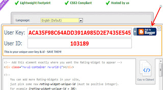
Step 4.  After clicking the Submit Button,  your User Key and User ID will appear, then hit the Add to Blogger Button and this bring to your Blogger Add Page Element window,

adding star rating widget

Step 5. Click the Add Widget button and you will be taken to your Blogger Lay-out page,

installing star rating widget

Step 5. And finally, drag the Star Rating Widget button below post body then click Save Arrangement button.
creating star rating widget


Have a nice Day and Enjoy!

Putting Social Media Sharing Buttons Below Every Post Title

One way pushing your initial traffic is  by knowing to the world that you have a such kind of blog that is unique from the other blog. In this tutorial, we will put Facebook, Twitter, Email, Print, G-mail, Stumble upon and Add this button. But you can also add another sharing buttons of your like. So let us go with the tutorial.

sharing buttons below post titles


Putting Social Media Sharing Buttons Below Every Post Title


(Always back-up your template)
Step 1. Go to Blogger Dashboard >> Template >> Edit HTML

 sharing buttons below  titles

Step 2. Look for the code <data:post.body/> (choose the third occurrence of the code)
and  just above it, paste the code below,

                       
<b:if cond='data:blog.url != &quot;ITEM&quot;'>
                         <b:if cond='data:blog.url != &quot;ITEM&quot;'>
                                 <!-- AddThis Button BEGIN -->
<div class='addthis_toolbox addthis_default_style addthis_32x32_styles'><table border='0'><tr>
<td><a class='addthis_button_preferred_1'/></td>
<td><a class='addthis_button_preferred_2'/></td>
<td><a class='addthis_button_preferred_3'/></td>
<td><a class='addthis_button_preferred_4'/></td>
<td><a class='addthis_button_preferred_5'/></td>
<td><a class='addthis_button_preferred_6'/></td>
<td><div class='addthis_toolbox addthis_default_style '> <a class='addthis_counter addthis_pill_style'/> </div> <script src='http://s7.addthis.com/js/250/addthis_widget.js#pubid=xa-4de3b2d654f56f28' type='text/javascript'/> <script type='text/javascript'> var addthis_config = { ui_cobrand: &quot;BLOGGINGTIPSANDTRIX&quot;, ui_header_color: &quot;#ffffff&quot;, ui_header_background: &quot;#0080FF&quot; } </script></td> </tr> </table></div>
                                   <!-- AddThis Button END -->
                                          </b:if></b:if><br/>


Step 3. Click preview, then if it is okey, save your template and you are done.
Short customization:
 1. To add one or more  sharing buttons, put the tag below just above this line <td><div class='addthis_toolbox addthis_default_style '> <a class='addthis_counter addthis_pill_style'/> </div> <script bla bla bla bla.......

  
<td><a class='addthis_button_preferred _#'/></td>
 Change # sign with next number of your button.
2. Replace ITEM  with the url of the page where you want to hide this particular widget.
3. Replace BLOGGINGTIPSANDTRIX  with the name of your blog.


Putting Sharing Buttons In Your Blogger Sidebar


Step 1. Go to Blogger Dashboard >> Lay- out >> Add Gadget


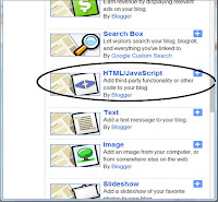
Step 2. In the pop-up window, scroll down and click HTML/Javascript

adding sharing buttons in sidebar

Step 3. Inside the blank box put the code below and then click Save Arrangement button.

<!-- AddThis Button BEGIN -->
<center><div class="addthis_toolbox addthis_default_style addthis_32x32_style">
<a class="addthis_button_preferred_1"></a>
<a class="addthis_button_preferred_2"></a>
<a class="addthis_button_preferred_3"></a>
<a class="addthis_button_preferred_4"></a>
<a class="addthis_button_preferred_5"></a>
<a class="addthis_button_preferred_6"></a>
<a class="addthis_button_compact"></a></div></center>
<script type="text/javascript" src="
http://s7.addthis.com/js/250/addthis_widget.js#pubid=ra-4fdb16d133fdf909"></script>
<!-- AddThis Button END-->

Happy Blogging to all of Us Bro!!!


Different Border Styles for Various Uses

I intentionally write this article to elaborate more those different border styles that add beauty to our CSS applications.

different border styles


Below are lists of border styles:


none: Defines no border

dotted: Defines a dotted border

dashed: Defines a dashed border

solid: Defines a solid border

double: Defines two borders. The width of the two borders are the same as the border-width value

groove: Defines a 3D grooved border. The effect depends on the border-color value

ridge: Defines a 3D ridged border. The effect depends on the border-color value

inset: Defines a 3D inset border. The effect depends on the border-color value

outset: Defines a 3D outset border. The effect depends on the border-color value

Explanation:
  • Border width, style,color and padding
  • In setting the width of the borders, we will use pixels (px in short)
    For the style, select among the nine styles (none, dotted, dashed, solid, double, groove, ridge, inset & outset)
    And lastly apply padding [this explains the distance of your  elements  from the borders and this being affected by the background color)
Example:
              border: 7px outset #642880; padding: 15px;

But you can also specify what border width, style and color  to be applied in  each side. Please take a closer look at the example below.

The css that used in this example is "background-color: #adad25; border-bottom: 15px ridge #B04F6F; border-left: 10px outset #2F2D7C; border-right: 3px inset #F8F835; border-top: 20px double #981510;padding: 20px;"

Now if you want to present something (text, image or video)

in your post that is being enclosed in a border, you can use the code below.


<div style="background-color: none;border-top: 5px double #B04F6F;border-right: 5px double #B04F6F; border-bottom: 5px double #B04F6F; border-left: 5px double #B04F6F; padding: 3px;">Enter your data here </div>

Change the border style, background color, width, color of each border and padding that would match on your data presented.

Have a nice Day Bro and Enjoy!
Credits goes to w3schools with little modification from me. 

Creating a Full Width and Removing Sidebar of a Certain Page Post

This post is the answer of the questions of many bloggers including me on how to increase the width of a certain page post and remove  sidebar to make it more attractive and let the readers to focus on our post only.
creating fullwidth page in blogger

 Creating a Full Width and Removing Sidebar  of a Certain Page Post


Always have a back-up of your template before editing.
Step 1. Go to Blogger Dashboard >> Template >> Edit HTML

creating fullwidth page in blogger

Step 2. Look for the code ]]></b:skin> and just below that, paste the code below,

creating fullwidth page in blogger


<b:if cond='data:blog.url == &quot;http://bloggingtipsandtrix.blogspot.com/2014/05/html-and-css-generator-for-blogger.html&quot;'>
      <style>
        .main-inner .columns {
          padding-left: 0px !important;
          padding-right: 0px !important;
        }
        .main-inner .fauxcolumn-center-outer {
          left: 0px !important;
          right: 0px !important;
        }
        .main-inner .fauxcolumn-left-outer, .main-inner .fauxcolumn-right-outer, .main-inner .column-left-outer, .main-inner .column-right-outer {
          display: none !important;
        }
      </style>
    </b:if>


Note: Replace the red highlighted text above with your own page url.

Step 3. Click Preview first to be sure, then Save your Template!
  • Replace the red highlighted texts with the url of the post you want this tweak to take effect.
  • If in case you have another posts that you want to apply  this kind of trick, just paste the same code below or after the first code that you had just applied.

Example.
 In my case, I  created a full width and  remove the sidebar both in my About and Contact page.
(Observe the two opening <b:if  and closing </b:if>)


<b:if cond='data:blog.url == &quot;http://bloggingtipsandtrix.blogspot.com/2013/04/var-servicedomainwww.html&quot;'>
   
      <style>
.main-inner .columns {
padding-left: 0px !important;
padding-right: 0px !important;
}
.main-inner .fauxcolumn-center-outer {
left: 0px !important;
right: 0px !important;
}
.main-inner .fauxcolumn-left-outer, .main-inner .fauxcolumn-right-outer, .main-inner .column-left-outer, .main-inner .column-right-outer {
display: none !important;
}
</style>
  </b:if>
    <b:if cond='data:blog.url == &quot;http://bloggingtipsandtrix.blogspot.com/2012/12/about-me.html&quot;'>
<style>
.main-inner .columns {
padding-left: 0px !important;
padding-right: 0px !important;
}
.main-inner .fauxcolumn-center-outer {
left: 0px !important;
right: 0px !important;
}
.main-inner .fauxcolumn-left-outer, .main-inner .fauxcolumn-right-outer, .main-inner .column-left-outer, .main-inner .column-right-outer {
display: none !important;
}
</style>
</b:if>

If you have some questions feel free to write it at the comment box below and we will try our very best to satisfy you. Peace on Earth Bro !!!
Credits goes to the author of this blog and to southerspeakers


Adding Twitter Follow Buttons In Blogger Sidebar

 In my previous tutorial, I  wrote an article about putting social media buttons that float in the left side of  your blog post body section and that is really cool . Likewise,  placing a social media button specifically Twitter Button in our sidebar adds professionalism to our blog.

Adding Twitter Follow Buttons In Blogger Sidebar


Step 1. Log in to Twitter and fill up the form with all the information needed

adding twitter follow buttons


Step 2. Copy  the code  at the right side of the form and paste it in the sidebar of your blog.
             Steps in putting the Twitter Follow Button(s) codes in your sidebar.
        A. Go to  Blogger Dashboard >> Lay out >> Add Gadget

adding twitter follow buttons

        B. In the Pop-up widow, scroll down and select HTML/Javascript
adding twitter follow buttons

        C. In the blank Page, paste the code that you get in the above step

Step 3.  Finally, click Save Arrangement :-)
Credits goes to way2blogging with some modification from the author.

Customizing Tables in Blogger Post

Yesterday, I wrote an article about Adding Tables in Blogger Post Editor and it features only the basic components of an HTML Tables. To make it more lively in appearance, it is advisable to add a little css codes on it. Now, I will show on how to add colors to your table borders and to its background.

Customizing Tables in Blogger Post


Step 1. Go to your Blogger Post Editor or Create New Post
Step 2. Copy and paste the code below to your Blogger Post Editor page (switch it on HTML mode).

<table cellpadding="0" cellspacing="0" style="border: 5px solid #158aee; width: 400px;"><tbody>
<tr>
      <td style="background: blue; border-bottom: 5px solid #FF0000; border-right: 5px solid #FF0000;">Row 1, Column 1</td>
      <td style="background: #D703FC; border-bottom: 5px solid #FF0000; border-right: 5px solid #FF0000;">Row 1, Column 2</td>
      <td style="background: #3BE21D; border-bottom: 5px solid #FF0000;">Row 1, Column 3</td>
</tr>
<tr>
      <td style="background: #A77C58; border-right: 5px solid #FF0000;">Row 2, Column 1</td>
      <td style="background: #F6FF00; border-right: 5px solid #FF0000;">Row 2, Column 2</td>
      <td style="background: #FCFFA3;">Row 2, Column 3</td>
</tr>
</tbody></table>

The above codes will create a type of table below:

Row 1, Column 1 Row 1, Column 2 Row 1, Column 3
Row 2, Column 1 Row 2, Column 2 Row 2, Column 3

We will take a closer shot on the above codes:
  • The tag style="border: 5px solid #158aee represents the style i.e. border around the table which is 5px solid in size and 158aee in color. You can select border styles here.
  • In the first cell (Row 1, Column1) and second cell  (Row 1, Column 2) we only styled the border bottom and border right  because they are covered by table outside main border. 
  •  In the third cell (Row 1 Column 3) we only styled the border bottom because it is being style by neighboring lines and main outside borders.
  • In the fourth cell (Row 2, Column 1) and fifth cell (Row 2 Column 2), it is only styled in both in border right because it is also influenced by the neighboring lines or borders respectively.
  • And lastly in the sixth cell (Row 2,Column 3), we did not apply any border style because it is also covered by other neighboring border cells.
  • Be careful in Adding Border Styles to each table cell because the border(s) of the other cell will be affected and cause  overlapping of the borders as shown below. 

  • Row 1, Column 1 Row 1, Column 2 Row 1, Column 3
    Row 2, Column 1 Row 2, Column 2 Row 2, Column 3

    The last cell (Row 2, Column 3) has two top borders because I add a css style which is border-top: 5px solid #176D87 that is not necessary.
  • If you want to change the background color of each cell, just replace the hexadecimal colors in each cell (it is preceded by the tag <td style="background:. You can choose a variety of hexadecimal colors here.
If there are still confuse or there are things which are not so clearly discussed, feel free to write us in the comment box below and we will try our very best to answer it.
Have a nice day to everyone and Enjoy !
Credits goes to mybloggertricks with some modifications from the author.

Adding Tables To Blogger Post Editor

Sometimes in order to present data to our readers, we need to put it in a table to make it more presentable and easy to understand. In this post, I will show the basic structure in making tables and how to customize it to make it ready for your viewers.

adding tables in blogger


Adding Tables To Blogger Post Editor


Step 1. Go to Blogger Dashboard >> New Post
Step 2. Switch your Blogger Post Editor in HTML mode and paste the code below.


<table border="1" cellspacing="0" cellpadding="2" width="400"><tbody>
 
    <tr> 
      <td>Row 1, Column 1</td>
      <td>Row 1, Column 2</td>
    </tr>
    <tr> 
      <td>Row 2, Column 1</td>
      <td>Row 2, Column 2</td>
    </tr>

    <tr> 
       <td>Row 3, Column 1</td>
      <td>Row 3, Column 2</td>
    </tr>

  </tbody></table>


The above codes will produce a table with three (3) rows and two (2) columns

Row 1, Column 1 Row 1, Column 2
Row 2, Column 1 Row 2, Column 2
Row 3, Column 1 Row 3, Column 2

Let us make things clear with through the  informations below:
  • The red bold texts show the start and end of the table structure
  • The table border is 1, you can also add borders or put it to 0
  • There you can see cellpadding and cell spacing
  • If you want to control the width of your table adjust the value 400px
  • The tags tr and td refer to rows and columns respectively
  • The above table has three (3) rows because I have put three (3) <tr> tag
  • The above table has three (2) columns because I have put three (2) <td> tag inside every <tr> tag
  • Always put a closing tag in every opening tag. Example <tr>...</tr> and <td>....</td>
  • To put a  data (image, text, video etc), switch your post editor to HTML mode and put the mouse cursor in between <td></td> tags
Click here to  fully customize your table (adding background, putting borders etc.)
Step 3.Save your Post and Enjoy your day pal!
Credits goes to mybloggertricks with some modifications from me

Adding Beautiful Stylistic Cascading Popular Post Widget

Today, we will style your popular post widget that is different from the others, for you can design it like a terrace in your sidebar. We will just add a css code from your blogger HTML editor. So let's jump ahead with the process.
customizing popular post widget

Adding Beautiful Stylistic Cascading Popular Post Widget


Note: Before editing your template, it is advisable to have back-up for it.

Step 1. Go to Blogger Dashboard >> Template >> Edit HTML

customizing popular post widget

Step 2. Look for ]]></skin> and just before this tag, paste the code below,

customizing popular post widget

#PopularPosts1 ul{margin:0px;padding:5px 0;list-style-type:none}
#PopularPosts1 ul li{position:relative;margin:5px 0;padding:3px}
#PopularPosts1 ul li:first-child{background:#EFF5FB;width:95%}
#PopularPosts1 ul li:first-child:after{content:"1"}
#PopularPosts1 ul li:first-child + li{background:#E0ECF8;width:90%}
#PopularPosts1 ul li:first-child + li:after{content:"2"}
#PopularPosts1 ul li:first-child + li + li{background:#CEE3F6;width:85%}
#PopularPosts1 ul li:first-child + li + li:after{content:"3"}
#PopularPosts1 ul li:first-child + li + li + li{background:#A9D0F5;width:80%}
#PopularPosts1 ul li:first-child + li + li + li:after{content:"4"}
#PopularPosts1 ul li:first-child + li + li + li + li{background:#81BEF7;width:75%}
#PopularPosts1 ul li:first-child + li + li + li + li:after{content:"5"}
#PopularPosts1 ul li:first-child:after,#PopularPosts1 ul li:first-child + li:after,#PopularPosts1 ul li:first-child + li + li:after,#PopularPosts1 ul li:first-child + li + li + li:after,#PopularPosts1 ul li:first-child + li + li + li + li:after{position:absolute;top:20px;right:-15px;border-radius:50%;background:#fff; border: 1px dotted #353535; width:20px;height:20px;line-height:1em;text-align:center;font-size:17px;color:black;}
#PopularPosts1 ul li a{font-size:12px;color:#444;text-decoration:none}
#PopularPosts1 ul li a:hover{color:#222;text-decoration:none}
#PopularPosts1 {
margin-left: 20px;
}
.PopularPosts img {
padding-right:.4em; height: 38px; width: 38px;
}
#PopularPosts1 ul li .item-thumbnail {
float: left; border: 0; margin-right: 10px; background: transparent; padding: 0;
}
Step 3. Click Preview then save your template  and see if it blend with your  blog's environment.

Customization (Optional):

You can choose a variety of hexadecimal color here
A. First part (the color of each popular post box).
    --- Box no.1-5 the hexadecimal colors are  EFF5FBE0ECF8, CEE3F6, A9D0F5, 81BEF7 respectively. Change these hexadecimal colors with your own likeness.

B. Second part (the with or distance of the box container).
   --- Box no.1-5 the width are 95%, 90%, 85%, 80%, and 75% respectively. Increasing the value will increase the width and decreasing the value will also decrease the width.

C. Third part (the circular  number tag in each box).You can find the code that control this part at 15th- 17th line of the codes.
  --- Change the position (y-axis or vertical ) of the circle that bears the tag by replacing 20px. (Less than 20px, will place it higher and more than 20px will place it in the lower position).
----Change the placement of the circle (x-axis or horizontal) by replacing right to left,
----Change the color of the number inside the circle by replacing black with your own,

D.  Fourth part (the Size of the thumbnail)
---- Change the height and width of the thumbnail by replacing 38px,

E. Fifth part (the position or placement  of the thumbnail)
----You can place the thumbnail by changing the yellow bold text ( you can replace it with writing right)

Thank you for your PATIENCE and Smile!
The credits goes to the author if this article and to helplogger


Adding Borders to Blog Content in Blogger

As you visit some blogs that there are borders that surround the post body and sidebar title. Adding borders to blog different parts somehow adds beauty on it. I will show very simple steps on how to do it. But before you will jump to the tutorial please click this link to be aquainted with the different border styles and its uses.

Adding Outside Main Borders to Blog Content in Blogger


Step 1. Got to Blogger Dashboard >> Template >> Edit HTML

adding borders to blog content

Step 2.  Look for ]]></b:skin>  and  just above it  paste the code below,
.content-inner {
border-top: 1px dashed #242424;
border-right:1px dashed #242424;
border-bottom:1px dashed #242424;
border-left:1px dashed #242424;
}
adding borders to blog content


Adding Borders  To Post- Outer


Copy and paste the code below above ]]></b:skin> 
.post-outer {
border-top: 1px dashed #242424;
border-right: 1px dashed #242424;
border-bottom: 1px dashed #242424;
border-left: 1px dashed #242424;
}

Adding Borders to Sidebar Title

#Your Sidebar Title ID h2 {
border-top: 1px dashed #242424;
border-right: 1px dashed #242424;
border-bottom:1px dashed #242424;
border-left: 1px dashed #242424;
}

Short Customizations:

1. To change the size of the border, you can replace 1px in every border side(top,right,bottom,left)
2. To change the border style, replace dashed with your own. You can select/choose it here.
3. To change the color of your border, replace 242424 with your own hexadecimal color, you can select it with our color code generator.
Step 3. Save your Template. Enjoy!

Hiding or Removing "subscribe to Post Atom Link" in Blogger

With the help of Feedburner, readers can easily subscribe to your blog posts by simply entering their email address  at box provided, but we know already that in the  template that we are using, blogger  had already installed a "Subscibe to Post Atom" link so that visitors could subscribe through to Atom feeds which has the same  function. Furthermore, this occupies additional space in your blog template bottom and it doesn't look good. In this scenario, you have two options, it's either to hide it temporarily or to remove it completely.

hiding or removing post atom

Hiding or Removing "Subscribe to Post Atom" Link in Blogger


Hiding "Subscribe to Post Atom" Link

Step 1. Go to Blogger Dashboard >> Template >> Edit HTML,

removing post atom link

Step 2. Search for the code ]]></b:skin>  and just above it paste the code below,
.feed-links { display:none; }

removing post atom link

Step 3. Save your template. Enjoy!

Removing "Subscribe to Post Atom" Link

Always back -up your template if in case things go wrong.

Step 1. Go to Blogger Dashboard >> Template >> Edit HTML,

removing post atom link

Step 2. Look for the code below, and delete it,
<b:include name='feedLinks'/>


removing post atom link


Step 3. Save your template and you can now smile! Enjoy!
Credits goes to Blogbulk.com with little modification from me.


How to Get Your Feedburner Email Feedlink


In order to have an Email Subscription Widget in your blogger blog, you must have get first a Feedburner Email Feedlink. In this article, I will show  very simple steps in getting your Feedburner Email Feedlink.
getting your feedburner feedlink

How to Get Your Feedburner Email Feedlink


Step 1. Log in To Blogger account
Step 2. Go to  feedburner.com
Step 3. Type your blog url in blank box as shown in the screenshot below, then click next

getting feedburner email feedlink
Step 4. After clicking Next, you will be taken to this page and  click again the next button as shown in the image below,
getting feedburner email feedlink
Step 5. After identifying your feed source, feedburner will give your feed title and feed address, then simply click next

getting feedburner email feedlink
Step 6. After clicking next, you will be brought to your Feedburner Account Dashboard, hit Publicize and click Email Subscriptions. The image below may help elaborate this particular step

getting feedburner email feedlink

getting feedburner email feedlink
Step 7. It is now time to get  your HTML inside the box. (Don't forget to click the code to be used in blogger if you want the code to be inserted directly to your Add Page Element in blogger). Please observe the photo  below
getting feedburner email feedlink
 In my case the set of codes are
<form style="border:1px solid #ccc;padding:3px;text-align:center;" action="http://feedburner.google.com/fb/a/mailverify" method="post" target="popupwindow" onsubmit="window.open('http://feedburner.google.com/fb/a/mailverify?uri=blogspot/meETl', 'popupwindow', 'scrollbars=yes,width=550,height=520');return true"><p>Enter your email address:</p><p><input type="text" style="width:140px" name="email"/></p><input type="hidden" value="blogspot/meETl" name="uri"/><input type="hidden" name="loc" value="en_US"/><input type="submit" value="Subscribe" /><p>Delivered by <a href="http://feedburner.google.com" target="_blank">FeedBurner</a></p></form>
The highlighted text in blue is the feedburner Email Feedlink and the pink highlighted text is the feed burner tiltle ( you can find this feedburner title also at the end of your feedburner Email feedlink)

Click here to add a beautiful Email Subscription Widget to blogger

Thank you for patience and Enjoy!


Adding Email Subscription Widget to Blogger/Blogspot


In customizing our sidebar, we should not forget to add an email subscription widget on it, not only to add spice to your sidebar but also it enhances your visitor to follow your blog's up to date post. This tutorial will show you not only adding email subscription widget but you can also customize it with your preferences.
Before proceeding to the tutorial, please get first your  Feedburner Email Feedlink here.  You can use our tutorial  for your guide.


Adding Email Subscription Widget to Blogger/Blogspot

Step 1. Go to Blogger Dashboard,
Step 2. Click Lay out,
Step 3. Click Add Gadget,
Step 4. In the Pop-up window, scroll down and select HTML/Javascript (click the plus sign),
Step 5. In the blank box, paste the code below,

<style>
.mbt-email{
background:url(https://blogger.googleusercontent.com/img/b/R29vZ2xl/AVvXsEgLbkrOD3VzqK6e2HkX3lFNAUmNAbKBD4MMA2SMlLRX46Y6TZLO2RKlPLqtIvMkthLSXURMsz4KQ3uJTRlDsq6KNs6bK8PsLO1Kg1nX7rdwjdImhy5ofP3IEDdjnyxTAoCuq36SMonuGgSs/s1600/email.png) no-repeat 0px 12px ;
width:250px;
padding:10px 0 0 55px;
float:left;
font-size:.7 em;
font-weight:normal;
margin:-15 0 1px -5;
color:#000000;
}
.mbt-emailsubmit{
background:#9B9895;
cursor:pointer;
color:#fff;
border:1px normal;
padding:3px;
text-shadow:0 -1px 1px rgba(0,0,0,0.25);
-moz-border-radius:6px;
-webkit-border-radius:6px;
border-radius:6px;
font:12px sans-serif;
}
.mbt-emailsubmit:hover{
background:#158aee;
}
.textarea{
padding:2px;
margin:6px 2px 6px 2px;
background:#f9f9f9;
border:1px solid #ccc;
resize:none;
box-shadow:inset 1px 1px 1px rgba(0,0,0,0.1);
-moz-box-shadow:inset 1px 1px 1px rgba(0,0,0,0.1);
-webkit-box-shadow:inset 1px 1px 1px rgba(0,0,0,0.1); font-size:12px;
width:170px;
color:#666;}
</style>
<div class="mbt-email">
Receive LATEST TUTORIALS via email by submitting your Email address below <form action="http://feedburner.google.com/fb/a/mailverify" id="feedform" method="post" target="popupwindow" onsubmit="window.open('http://feedburner.google.com/fb/a/mailverify?uri=blogspot/meETl', 'popupwindow', 'scrollbars=yes,width=550,height=520');return true">
<input gtbfieldid="3" class="textarea" name="email" onblur="if (this.value == &quot;&quot;) {this.value = &quot;Enter your email  here...&quot;;}" onfocus="if (this.value == &quot;Enter your Email here...&quot;) {this.value = &quot;&quot;;}" value="Enter your Email  here..." type="text" />
<input type="hidden" value=" blogspot/meETI " name="uri"/><input type="hidden" name="loc" value="en_US"/>
<input class="mbt-emailsubmit" value="OK" type="SUBMIT" />
</form>
</div>
Short customization: Optional

First part (.mbt-email)

adding email subscription to blogger


1. To change the font size of the text "Receive LATEST TUTORIALS via email by submitting your Email address below",  change .7 (increase numerical value will also increase its size and  lower value will also decrease its size)


2. To change the color of the text "Receive LATEST TUTORIALS.........." replace the hexadecimal color  #000000. You can choose it here.


Second part (.mbt-emailsubmit)

adding email subscription to blogger


1. To change the border style of the box that encloses the text "OK",  change 1px solid #ccc, you can choose it here
2. To change the font size of the text " OK", change 12 px  (increase numerical value will also increase its size and  lower value will also decrease its size)


Third part (.mbt-emailsubmit:hover)
1. To change the color of the box that bears the text "OK", change the hexadecimal color 158aee with your own color preferences. You can choose it through our color code generator

Fourth part (.textarea)
adding email subscription to blogger


1. To increase the  size of the text area, change 170px with own text area size (it depends upon the length of the texts that you want to put inside  the box)

adding email subscription to blogger


Fifth Part (div class="mbt-email")

1.To change the text above the text area,change "Receive LATEST TUTORIALS via email by submitting your Email address below" with your own
2. Replace http://feedburner.google.com/fb/a/mailverify?uri=blogspot/JHOLw with your own Feedburner Email Feed link. You can get it by visiting your feedburner account then navigate to Publicize and then to Email Subscriptions.
3. Replace  blogspot/JHOLw with your own, you can find it in your feedburner account after the equal sign, in my case blogspot/JHOLw is the last code.

Step 6.   Click Save Arrangement and Enjoy!
 Thanks for your patience.

The credits goes to Allbloging tips and to the author of this blog.

How to Customize Sidebar Header in Blogger

One of the things that a blogger should not forget is to customize his/her sidebar header according to his/her likeness. In this tutorial, I will show on how to add background image or color to your blogger sidebar header.
adding background image to sidebar header

How to Customize Sidebar Header in Blogger


Step 1. Identify first the ID of your widgets/gadgets that you have put in your sidebar section,

       Steps in identifying your individual widget Id in your blogger template.
           1.1 In the other window, Log- in to your Blogger Account go to Blogger Dashboard, click Template, hit Edit HTML button,
adding background image to sidebar header
           1.2 Click Jump to Widget then click the name of your widget or if you can't find your widget's name in the Jump Widget Menu,  you can Press Control F and Type the name of your widget inside the search box then click Enter in your keyboard,
adding background image to sidebar header
           1.3 After finding the name of your widget, for example you are looking for the  Popular Post Widget, you can find this set of code below,
<b:widget id='PopularPosts1' locked='false' title='Popular Posts' type='PopularPosts'>
The bolded text in red above is the ID of your Popular Post Widget. Repeat step no. 1.3 to find the ID of your other widgets.

There is also another way of locating or knowing the ID of your widget. Here are the steps.
  • Go to your Blogger Lay-out page
  • Find the symbol below or the text edit ( in blue color)
    locating the widget id


  • Click it and you will see the codes that you have inserted before,click the link at the top portion

  • finding the widget id


  • The last code being underline with the red arrow above (HTML12) is the ID of the widget
  • Step 2. After getting your Individual Widget ID, save that for you will use that in the next step,
    Step 3. In the other window, go to Blogger Dashboard, click Template and hit Edit HTML button,
    adding background image to sidebar header

    Step 4. Search for the code  ]]></b:skin> and just above it, paste the code below,

    #PopularPosts1 h2 {
    background: url(https://blogger.googleusercontent.com/img/b/R29vZ2xl/AVvXsEjWWVeUagGB8oTT3qgwmKu3bxPANo8HT51EGgiUmsvoCpP3E6bB0JIRczfsd_mtfkuFj-zTx2Satf_MzWAAJMyfhEU-G1QHu8Salsf9Mk1LjDd7l4t37kJtc3Wfi7PuM2oOogtS2Ty5uWA/s1600/photo++for+sidebar.jpg);
    height:30px;
    width: 248px;
    margin-left: 0px;
    padding-top:0px;
    font-family: Sans-serif, Arial, Helvetica;
    font-size: 25px;
    text-align: center;
    }

    Short Customizations:

    • Replace the text in red with your own sidebar widget ID that you have save in Step 2.
    • To change the image background,Replace  URL image in (orange color) with your own image  (image size is width=248 px by height= 41px) or depending upon the width lay-out of your sidebar.
    • Adjust the height and width of your image by replacing the numerical value in yellow highlighted text
    • Adjust the margin and  depending upon the placement of the image background in your side bar
    •  Adjust placement of the title of the widget inside the image background. You can also place that in left or in the right corner of the background image.

    Step 5. Save your template and Enjoy.


    How to Add Recent Comment Widget With Thumbnails

    Having a problem on how to invite your readers to post creditable comments from your post? Posting a comment takes time for your readers to think of what will be their comment to be posted in your comment box area and sometimes they just leave and go for another blog to search for the answer of their questions. But when they leaved a short comment, it means that they are interested with the topic or they want to ask another thing which you did not include in your article. Consequently, in the long run you as a blogger  could established  a regular readers in your blog. In order for you to that, we will put a widget in your sidebar that would invite them to leave their comments below your  post  because as they leave comments it will automatically be found in your Recent Comment widget in your sidebar.


    How to Add Recent Comment Widget With Thumbnails


    Step 1. Go to Blogger Dashboard, click Lay-out and hit Add Gadget, 


    adding recent comment widget

    Step 2. After clicking the Add Gadget, a pop-up window will appear. Scroll down and select
    HTML/Javascript (click the plus sign)
    adding recent comment widget

    Step 3. Write a title of your widget and place the code below inside the empty box

    adding recent comment widget

    <style type="text/css">
    ul.w2b_recent_comments {
        list-style: none;
        margin: 0;
        padding: 0;
    }

    .w2b_recent_comments li {
        background: none !important;
        margin: 0 0 6px !important;
        padding: 0 0 6px 0 !important;
        display: block;
        clear: both;
        overflow: hidden;
        list-style: none;
    }

    .w2b_recent_comments li .avatarImage {
        padding: 3px;
        background: #fefefe;
        -webkit-box-shadow: 0 1px 1px #ccc;
        -moz-box-shadow: 0 1px 1px #ccc;
        box-shadow: 0 1px 1px #ccc;
        float: left;
        margin: 0 6px 0 0;
        position: relative;
        overflow: hidden;
    }

    .avatarRound {
        -webkit-border-radius: 100px;
        -moz-border-radius: 100px;
        border-radius: 100px;
    }

    .w2b_recent_comments li img {
        padding: 0px;
        position: relative;
        overflow: hidden;
        display: block;
    }

    .w2b_recent_comments li span {
        margin-top: 4px;
        color: #666;
        display: block;
        font-size: 12px;
        font-style: italic;
        line-height: 1.4;
    }
    </style>
    <script type="text/javascript">
    //<![CDATA[
        // Recent Comments Settings
        var
     numComments  = 5,
     showAvatar  = true,
     avatarSize  = 60,
     roundAvatar = true,
     characters  = 40,
     showMorelink = false,
     moreLinktext = "More »",
     defaultAvatar  = "http://www.gravatar.com/avatar/?d=mm",
     hideCredits = true;
    //]]>
    </script>
    <script type="text/javascript" src="http://helplogger.googlecode.com/svn/trunk/w2b recent comments with avatars.js"></script>
    <script type="text/javascript" src="http://name of your blog.blogspot.com/feeds/comments/default?alt=json&callback=w2b_recent_comments&max-results=5"></script>


    Short Customization:


    1.To change the number of comments to appear in the widget, replace the value of 5 in numComments= 5 and max-results=5"
    2. Change the  bold text in red name of your blog with your own blog's name
    3. Change the thumbnail size (avatar) 60 with your own 

    Step 4. Hit Save Template and enjoy!
    Credits goes to helplogger with some modification from me.